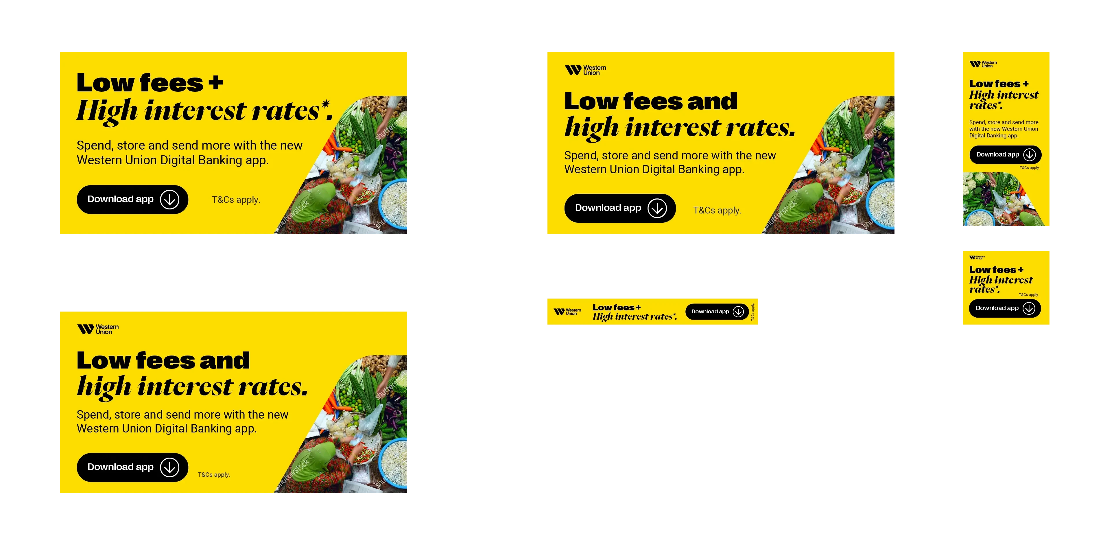
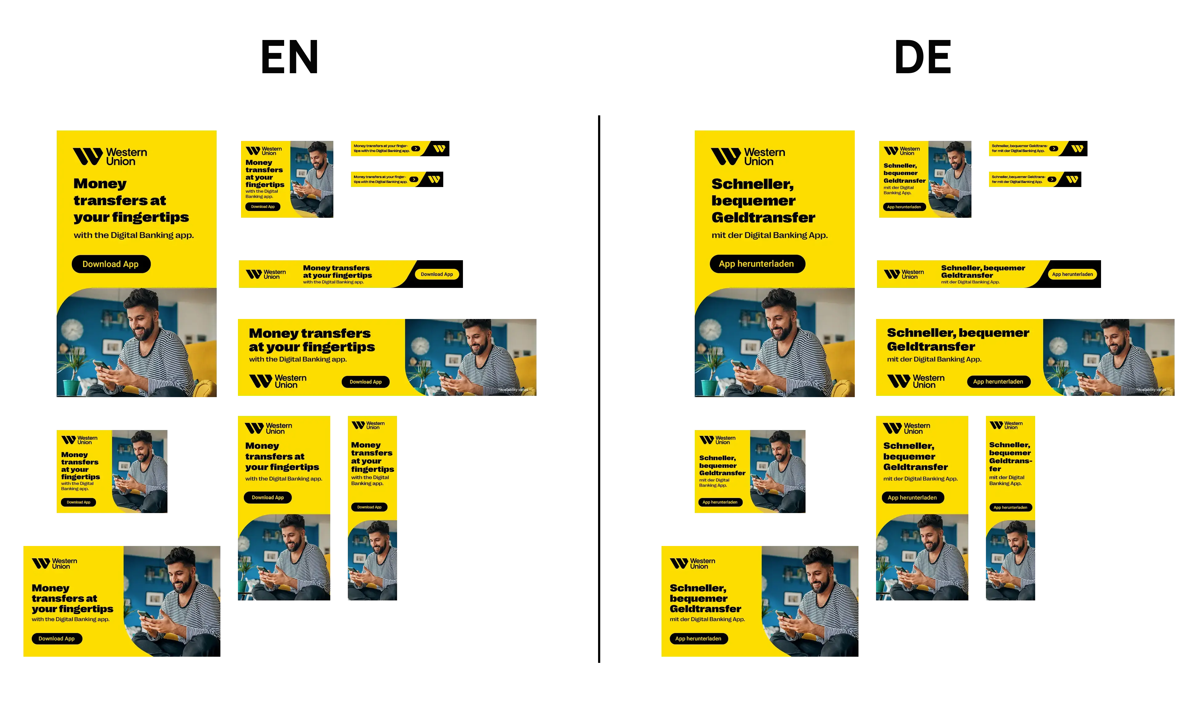
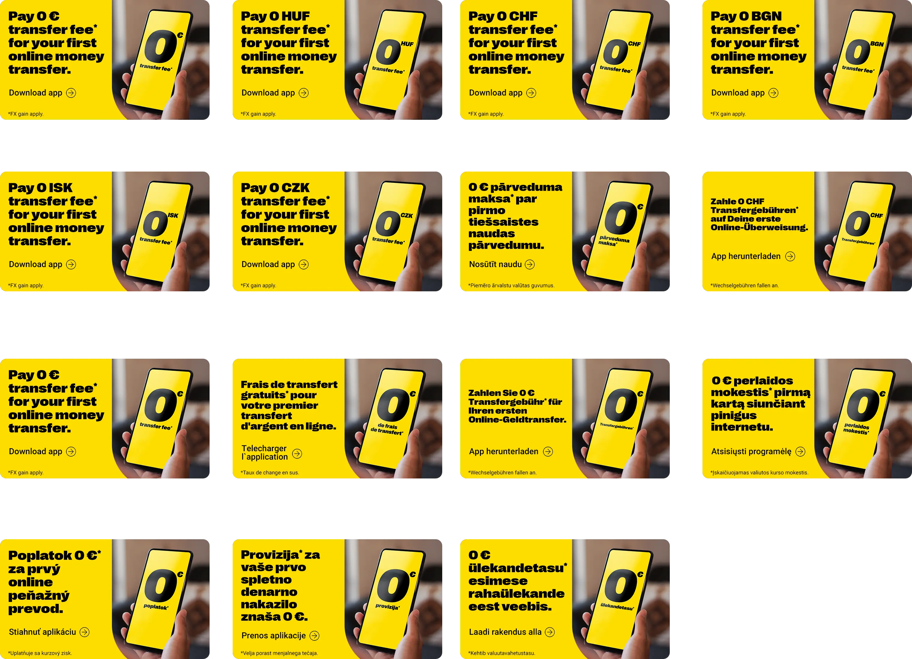
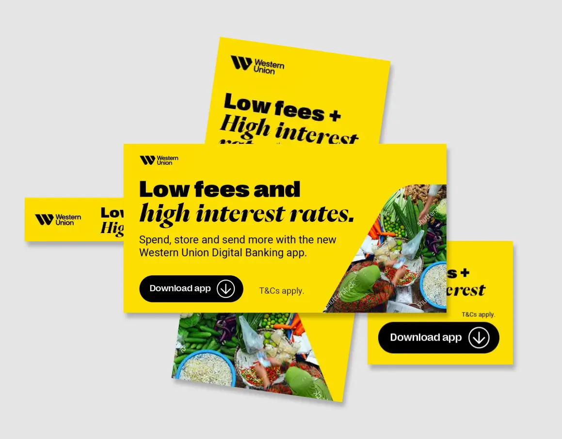
Multi-language posters, banners, and digital ads for one of the world's most recognisable financial brands — brand-precise, globally consistent, locally relevant.
The challenge
Western Union operates in 200+ countries. Every ad needs to communicate trust and global connectivity while feeling relevant to its local audience — in their language, their context.
Strict brand governance: exact logo placement, approved color palette, specified fonts. No room for improvisation — only room for precision.
The approach
Brand guidelines treated as a production system — every element locked to spec, every format adapted cleanly. Multilingual layouts built with enough flex to handle text expansion without breaking the design.
Imagery that depicted real human connection — the emotion behind a money transfer — without drifting into cliché. Global in reach, personal in feel.
Scope of work
Result
Campaign materials that worked identically across languages, formats, and markets — on-brand everywhere, adapted where it mattered. Production at global scale without sacrificing quality at the detail level.
Client: Western Union — global financial services operating in 200+ countries and territories.
Start a project
Multi-language, multi-format, on-brand everywhere — we build the creative system, then execute it at volume.
Get in touch